사용 환경에 따라 달라지는 뷰포트의 크기를 위해서 우리는 Meta tag를 활용한다. head 안에 삽입하여 사용하고
다음 예시와 같다.
<!DOCTYPE html>
<html lang="en">
<head>
...
<meta name="viewport" content="width=device-width, initial-scale=1">
...
</head>
Meta tag
the meta tag (<meta>) is used to instruct the browser on how to render the webpage’s scale and dimensions
attribute로 받는 것들은
- the name="viewport" attribute: tells the browser to display the web page at the same width as its screen
- the content attribute: defines the values for the <meta> tag, including width and initial-scale
- the width=device-width key-value pair: controls the size of the viewport in which it sets the width of the viewport to equal the width of the device
- the initial-scale=1 key-value pair: sets the initial zoom level (Read more about scale at MDN’s viewport documentation) Minimum: 0.1. Maximum: 10. Default: 1. Negative values: ignored.
@media only screen and (max-width: 480px) {
body {
font-size: 12px;
- @media — This keyword begins a media query rule and instructs the CSS compiler on how to parse the rest of the rule.
- only screen — Indicates what types of devices should use this rule. In early attempts to target different devices, CSS incorporated different media types (screen, print, handheld). The rationale was that by knowing the media type, the proper CSS rules could be applied. However, “handheld” and “screen” devices began to occupy a much wider range of sizes and having only one CSS rule per media device was not sufficient. screen is the media type always used for displaying content, no matter the type of device. The only keyword is added to indicate that this rule only applies to one media type (screen).
- and (max-width : 480px) — This part of the rule is called a media feature, and instructs the CSS compiler to apply the CSS styles to devices with a width of 480 pixels or smaller. Media features are the conditions that must be met in order to render the CSS within a media query.
- CSS rules are nested inside of the media query’s curly braces. The rules will be applied when the media query is met. In the example above, the text in the body element is set to a font-size of 12px when the user’s screen is less than 480px.
min-width / max-width
미디어 쿼리에 () 안에 들어가서 사용
/* ruleset for 320px - 480px */
}
min-resolution and max-resolution
DPI (dot per inch)라는 단위를 사용하여 , 사용자의 적용가능 해상도에 따라 보여지는 이미지의 해상도를 결정하게 할 수 있다. 미디어 쿼리에 입력할 수 있는 기능으로 min-resolution and max-resolution이 있다. and와 엮어서 위에 나온 min widht등을 다른 속성과 연계지어 더 길고 상세한 조건으로 사용 할 수도있다.
dpi 혹은 dpc를 값으로 가진다. 예시는 다음과 같다.
@media only screen and (min-resolution: 300dpi) {
/* CSS for high resolution screens */
}
}
}
And operator와는 다르게, 조건 중 한가지만 만족되어도 실행되게 하고 싶다면 콤마(,)를 사용하면 된다.
만약에 우리가 아래 두 조건 중 하나만 만족해도 실행되게 하고 싶다면 , 예시와 같이 작성하면 된다.
참고로 orientaion 속성은 사용자의 화면이 가로가 더 큰지 세로가 더 큰지로 landscape와 portrait 모드로 구분한다.
- 화면의 크기가 480px보다 클 때
- 화면이 가로(landscape)모드 일 때
@media only screen and (min-width: 480px), (orientation: landscape) {
/* CSS ruleset */ }
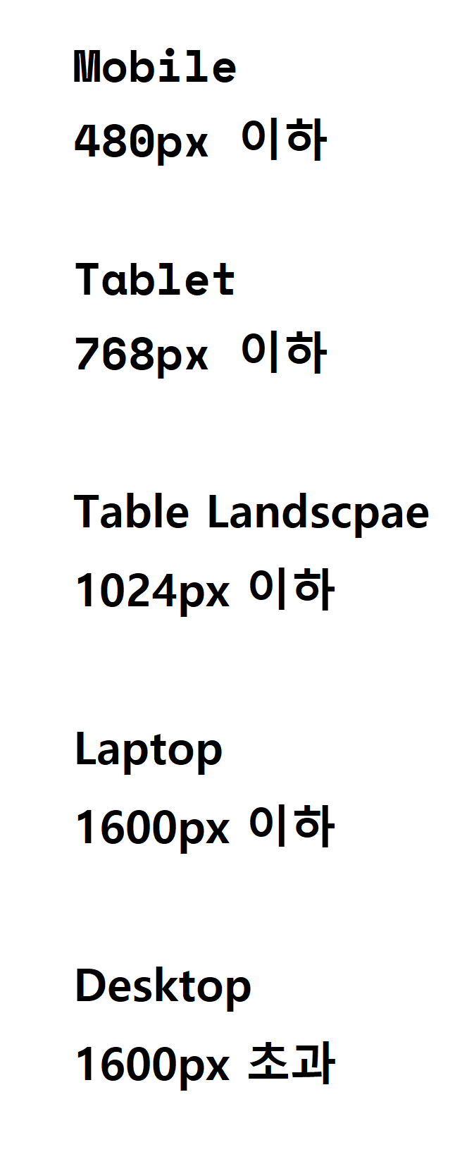
사용자의 환경에 따라 화면에 적용되는 속성이 적용되지 않기 시작하는 시점? 정확한 개념은 모르겠음 . 화면이 깨지기 시작하는 시점? 으로 이해 아래 요약
}
'IT 관련 > 개발(Codecademy)' 카테고리의 다른 글
| JS 자바스크립트 (1) (1) | 2022.12.26 |
|---|---|
| 개인 프로젝트 Reedio 웹페이지 만들기 (0) | 2022.12.25 |
| Grid 심화 (0) | 2022.12.14 |
| Grid 만들기 / grid area와 span 활용 (0) | 2022.12.12 |
| Responsive Website 만들기 . 사용환경에 따라 달라지는 화면 적용/flex box에 관해서 + 쉽게 배우는 사이트 추천 (0) | 2022.12.09 |